
Hi all,
This week we will look to create a polar chart in Tableau from scratch with all the calculations explained. This will be built in a way that it works as a template, so if you don’t particularly care for how the template works under the hood but would like to just replace it with your own data, by all means just download the data template from github and download the workbook from Tableau Public.

Here is the chart we are going to create. I’ve previously written about how to build charts very similar to this.
You can read them here, and here.
Both still work, but this goes to that next level with layers of adding labels and figures, and removes the need for a mapped background. I would say the other two templates I’ve created are intermediary and this one is advanced.
If you want to use the template, simply download it from the top of the page, replace the data source with your own. Just remember to make your dimensions unique names and it should update.
See below for where I’ve updated the template with 13 different metrics. All metrics must be a value out of 100 for this to work.

So…. now for those that want to understand the calculations.
001. Max Dimensions
{ Fixed : countD([Record ID])}
Find the maximum number of records, i.e dimensions we will want to plot. In the carlos viz this would mean it is 9, in the template this figure is 13. The number of slices.
001. Max T
/*Find the maximum number of records, i.e dimensions we will want to plot. The example is 50 (youll see the T values in the excel) – this doesnt need to be changed! We minus 2 because we use T to start and end at the origin… you’ll see this in later calcs, and we take off the extrra one so it aligns to the centre */
002. Rank
[T]
I just like to keep all my radial calculations the same terminology, you don’t necessarily need this calculation. But we will rank all our T values, so we can start to move them to draw up that nice curved edge.
003. Angle
360/[001. Max T]
/* The angle between each dot for data densification, 360/50 as the T values only go up to 50.
*/
[002. Rank] * [003. Angle]
/ [001. Max Dimensions]
Space the dots out. There should be equal space between each dot
Divide by the number of segments we have. An alternative way to think about this is a full circle with 50 dots in it…. then saying woops we actually want 8 segments of that, so we squeeze all those 50 points in together and repeat it 8 times.
Hopefully makes sense so far?
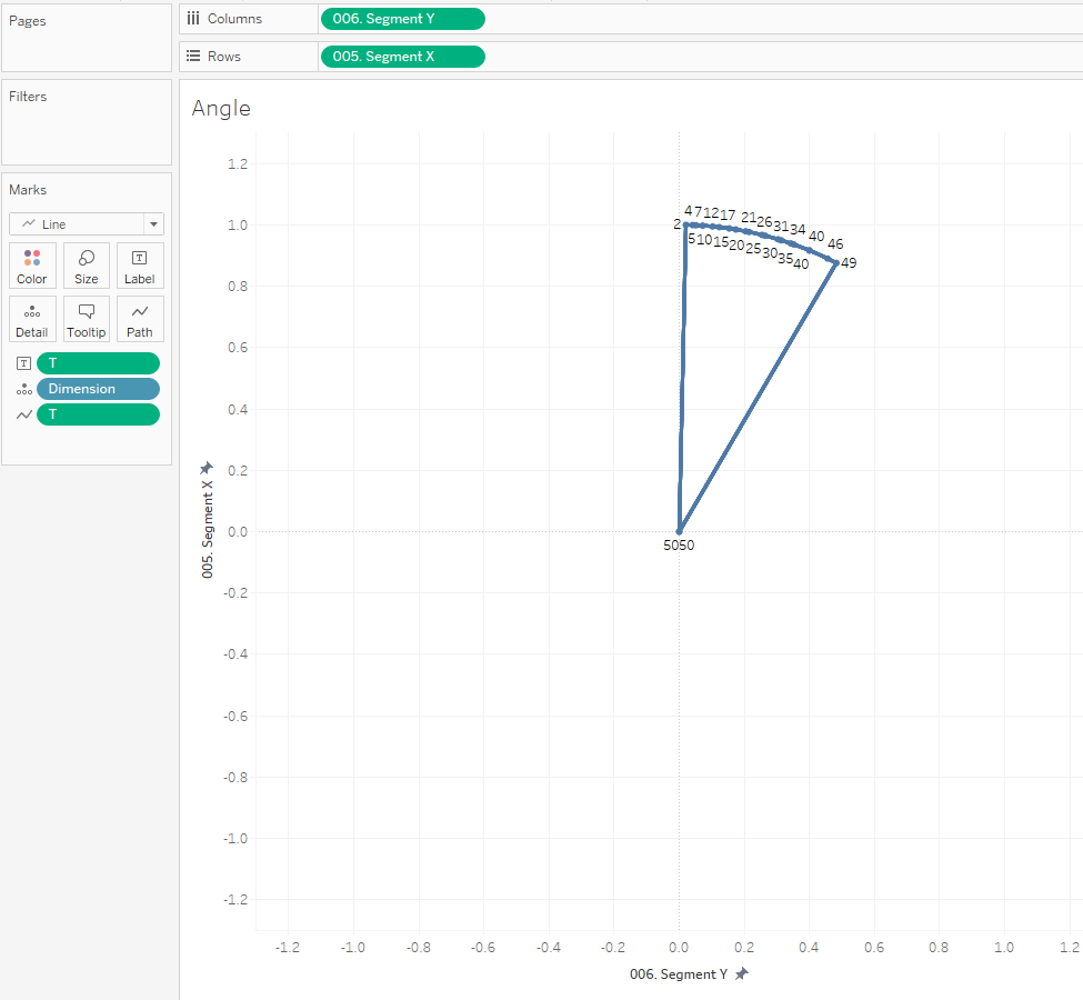
005. Segment X
if [T] = 1 then 0
elseif T = 50 then 0
else
cos(radians([004. Rank Angle]))
END
We are building each segment separately, so our start point is our origin, as is our end point. Anything in between use trigonometry to make it a circle.
006. Segment Y
if [T] = 1 then 0
elseif T = 50 then 0
else
sin(radians([004. Rank Angle]))
end
Do the same but use sin…. basic trigonometry. If maths isn’t your jam just take it as gospel. If we then plot these values against one another.
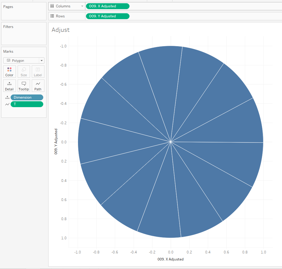
So what this leaves us with is the centre point (where T is 1 and 50) and all the other values evenly spaced between T 2 up to T49. This however is the same segment 13 times over. What we now want is to rotate each slice around the point (0,0) dependent on whatever metric it is.
007. X
The calculation for rotating around an arbitary point is x1 = x0cos(θ) – y0sin(θ)
So applied to our data that calculation is
[005. Segment X] * (cos(radians(360/[001. Max Dimensions]*[Record ID])))
– [006. Segment Y] * sin(radians(360/[001. Max Dimensions]*[Record ID]))
& for Y the calculation is:
008. Y
y1 = x0sin(θ) + y0cos(θ)
Which means applied to our Tableau calculation that is
[005. Segment X] * (sin(radians(360/[001. Max Dimensions]*[Record ID])))
+ [006. Segment Y] * cos(radians(360/[001. Max Dimensions]*[Record ID]))

Plotting these new X and Y calculations against one another we get this wheel / Pizza type shape. See how it is the same segment just repeated 13 times.
The next thing I noticed was that dependent on the number of slices my chart sometimes has a vertical line sometimes it doesn’t so I wanted to add in the ability to rotate the whole wheel. I.e just spin it around up to 360 degrees around the centre point.
What we need is a parameter that is a value between 0 and 360. We can call this P. Rotate.

To adjust our chart, we theoretically use the same x & Y calculation, but we build them off the previous so our new X is,
009. X Adjusted
[007. X]*cos(RADIANS([P. Rotate]))
– [008. Y] * sin(radians([P. Rotate]))
and our new Y calc is
009. Y Adjusted
[007. X] * (sin(radians([P. Rotate])))
+ [008. Y] * cos(radians([P. Rotate]))
Now if you plot these two values against one another and show the parameter you will see how it spins when you change the degrees.
The next thing we need to consider is that when we use trigonometry to create these segment / circle that the radius equals 1. See how the circle goes between -1 and 1 in both and x and y values. So now we need to scale these based on our different segments ratings out of 100!
010. X Sized
[009. X Adjusted] * ([Rating – 100]/100)
This therefore just makes it proportionally a value between 0 and 1.
010. Y Sized
Same with Y
[009. Y Adjusted] * ([Rating – 100]/100)

Perfect, something that now is starting to represent our final product.
So now you could leave it like this and flick the marks between either line or polygon but why not add some extra details?
Let me talk through the different layers in the template.
MP. Poly
MAKEPOINT(-[010. Y Sized],[010. X Sized])

Plot our Y and X co ordinates, I put minus in front of Y so that we have the metrics clockwise when on the visual. Do remember if you do this for one, you may need to follow the same logic in your other calculations.
MP Base
MAKEPOINT(-[009. Y Adjusted],[009. X Adjusted])
This is a line outline to help shape our visual by plotting where the maximum values could be i.e the full circle up to 100 ratings.

MP Base 50
MAKEPOINT(-[009. Y Adjusted]/100*50,[009. X Adjusted]/100*50)
Remember our full circle of slices? Here I am saying create one half the size. I bring this to the page to show the 50 rating circle and then make this a dashed line. In the screenshot below it is the black circle.

MP. 0
makepoint(0,0)
This is just a centre point, It is not required, but maybe if you are looking at a specific player you may want to add a shape layer with the persons face in?
MP. Label
if [T] = 25
then
MAKEPOINT(-[009. Y Adjusted]*1.25,[009. X Adjusted]*1.25)
END
Where T is 25, that is roughly the mid point of each segment. the *1.25 moves the label outside of the circle.

Finally lets use the same logic but add in those values onto the chart
MP. Value
if [T] = 25
then
MAKEPOINT(-[010. Y Sized],[010. X Sized])
END

There we have it. Lots more customisation you could bring into this but I hope it gives you more flexibility when it comes to radial charts.
Do ping me if you get stuck, I’m always happy to help.
LOGGING OFF,
CJ