
My FIRST EVER Iron Viz Entry.
What a feeling. I loved putting together my first ever Iron Viz. In my personal opinion it really has acted as a milestone for the past year of growth and development. Those who know me, know how important continual learning is to me. If you’re not learning, you’re not growing to be your best. To be able to have a platform where I can learn from others who share a passion for data, whilst celebrating one another’s success along the way really is something special.
I have been blown away by the sheer quality of visualisations within the competition. Congratulations to every person who entered.
If you’d like to view some of the entrants seen on Twitter please check out the gallery Will Sutton put together here. Tableau at some point will have a more accurate gallery of all entries.
I have written this blog over a series of evenings, just shortly after the feeder has finished. This blog post will cover some raw thoughts on putting together my Iron Viz Feeder. It will be more from an approach and resource angle rather than how well it marries up to the marking criteria. This is in the hope that it may inspire you to take elements from it, improve them and make it your own.
Overall I’m proud of my visualisation because it is a reflection of me. You can check the full version out using the link at the top of the page.
- BACKGROUND
Resource
My first time using Figma. And wow, it’s actually REALLY good. I love how intuitive it is to use. Autumn and Lindsay, amongst others have been doing some awesome tutorials on this front, which I’d recommend staying up to date with. Two examples are here: Autumn’s blog. Lindsay’s youtube.
I created separate A4’s landscape and ended up gluing them together section by section, using the grouping tool before exporting.

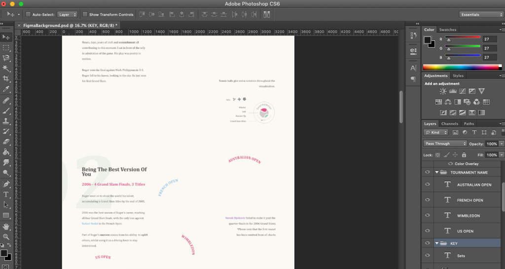
I ended up building the base in Figma, along with text (which saves in such a higher quality than previous tools I was using) then exported and added some final elements in photoshop, such as the key because it’s what I’m use to and made life easier for me.
The visualisation ended up taking a lot of reshuffling. Patience is key whilst you figure out where everything is going to sit. Alignment and spacing can be a tricky one!
Tip: One thing I found that was useful was to export the whole dashboard as an image and overlay it into my Figma version. This meant I roughly knew where each chart component currently sat! You can then turn the opacity down.
Thoughts
I particularly focussed on getting the spaces between sections reasonable, as well as the alignment down the left and right side. During the build phase I ended up changing the grid at the bottom (section 4) from an 8 column (for 2 years worth of grand slam horizontally) to just 1 year of slams and therefore much longer – which opened it up for a timeline with more analytics to accompany the visualisation in section 4.
I played around with a colour tool on Adobe, where I also created my palette to try and make sure it was suitable for all eyesight’s. You can put it through a colour blind simulator. The colours I aimed for were a blend of royal/elegant but simultaneously modern. I think it suits the story of the viz.

2. IDEAS
Thoughts
I had to reign in the abstract ideas slightly to focus on getting the analysis and story telling right. I did have some more ‘out there’ ideas to do with a nature theme which ended up getting stripped back. The small floral elements I think ended being quite complementary due to the colour palette and grand slam title wreath but that’s just my humble opinion.
The build of the small multiples and the key in section 1 are both inspired originally from the Wimbledon logo. I wanted something that was round with the tournament name within it.
Resource
It was also my first time going to Behance for inspiration and came across the likes of Gabriele Rossi, Valentina D’Efilippo , Michela Lazzaroni amongst others. It’s a wonderful resource that I think I will use more in the future in addition to my Pinterest page.
If there were one person I had to choose as a sports illustrative favourite from scrolling on Behance over the course of IronViz season it would be Matt Miller. His golf visualisations are out of this world. I’d like to implement some more of these concepts in the future.
Finally, as noted in the bottom of my viz. I took a good look at previous years entries and was hugely inspired by Alex Jones Coruna visualisation when it comes to layout and sequence.
3. BUILD
What you won’t see is that all my visual elements are prepped separately and then moulded into what they are. Theoretically I built everything twice!
Section One (Note section headers are named after the sheets in the workbook!)
The tournament bracket is an adaptation of the guest blog I did in collaboration with the FlerlageTwins, which is really just a hacked bump chart.

Section Two
The tournament polygons are an amended version of the FlerlageTwins sunburst tutorial. I ended up creating each of them separately and re-exporting the finalised dataset to then create the charts in one sheet.
The curved line is using some logic stolen from FlerlageTwins Arc Sankey tutorial and then just amending the calculation of the points to widen for my tournament charts to fit through them. There is probably a much prettier way of creating this curve but it worked for what I needed.
Finishing touches of the set flower and the tennis balls then added for extra notation, which you will see in the calculations if you download the workbook.

Drawing players
The player were drawn separately. Once re-sizing the player and lining up, I managed to create a path between where the curved line stopped and the player starts. I used this fantastic tool, where I re-drew over an image all the different points for the players, and then had to rescale them accordingly in Tableau. You can find the tool here.

I felt like the drawing of the players gave the piece a more fluid motion. The initial idea of having a tableau drawn image came from Mariona Banyeres Migration visualisation for the IronViz 2019.
Section Three
This was fairly simple to make and was just built straight from the original dataset. The complexity came from aligning it to the left side of the page whilst positioning the player and text round it.

Section Four
For Section 4, I have written a separate blog post completely on how to create this style of chart. The origination is credited to Lisa Rapp.
The only addition that was made was the timeline down the side. This is a vertical line chart between 2003 and 2021. I ended up rescaling the points to fit into the map layer to make an axis.
The year detail acts as a great axis for both the ATP world ranking and the more abstract shapes simultaneously. It was built by just having a constant x-axis, but an amended Y based on the date field of the line chart.

4. FINDING IMAGES
Noun project is a great resource for vectors. I end up normally re-colouring things in Photoshop but there are plenty of tools you can do this in, even Power point.


5. SWEATING THE SMALL STUFF
There are a few niceties that people may not have noticed if they only saw my twitter print-screens, but I am super proud of:
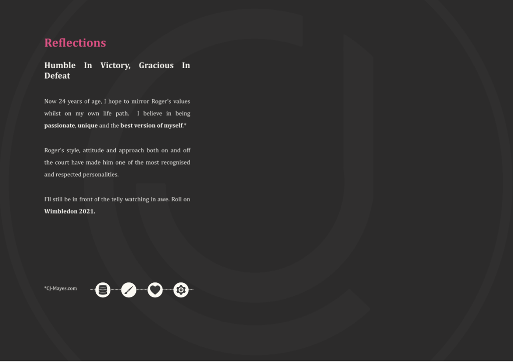
- My website logo on the last section faded into the background.
- The values are a reflection of me and are stated from my website.
- The symmetry in opening and closing statements.
- The key runs throughout the whole visualisation in terms of the sets and winner circles.
- The intent to use lines to act as flow throughout the visualisation often having a tableau drawn tennis player as end points, also acting as additional tooltips.
- Only using 4 sheets overall for no reason, other than it’s fun. Looks tidy until you click into the sheets, ha.
- Actually commenting some of my calculations! I will know if people downloaded the workbook, as they will see my thank you note on the icons sheet.
Anyway. I hope some of the resources listed help in future – I thoroughly enjoyed creating my IronVizFeeder for 2021. Congratulations again to everyone who got involved – I’d love to read stories about your own experience.
Happy to have seen my idol back playing in front of the crowd he loves at Wimbledon, enjoying every moment of it. That’s what it’s all about.
Any questions – get in touch on Twitter.
LOGGING OFF,
CJ