
This blog looks to cover at a high level how I pieced the visualisation together, as well as resources in the community that I leant on. It will contain my usual waffle, a few pro’s and con’s I found on the way, and hopefully give some insight as to the way my brain operates. Please feel free to download a copy of the workbook if you’d like to understand how it was made!
Hello.
Thanks for joining me for another blog.
Some of you may have seen my UEFA Champions League visualisation posted on Tableau Public, seen through the link at the top of the page. To save you a click, here it is again!

PURPOSE
The first thing to highlight is that for this visualisation I wanted to focus primarily on the design. I was going for a ‘print’ type visualisation. The second focus point was on wanting to make the visualisation solely using the tools only on Tableau. I.e. only using the existing Tableau shape files as well as through having to create polygons and utilising data densification to get the rest of my desired effect. With most my visualisations on my page I want to try something new that I haven’t before, be it through design, chart type or calculations. (This is my excuse at least as to why some visualisations might not always be deemed the acme of beauty.)
Tableau Public, to me, is such a fantastic way of documenting learning and progression, showing my way of thinking through visuals, as well as being a chance to explore different techniques. All whilst interacting with the community. Much like these blogs, I suppose.
INSPIRATION & RESOURCES
Before we dive in, here are some of the initial inspirations and resources I used and how they impacted my way of thinking.
Lisa produced this stunning ‘Game of the Year’ visualisation seen below. I couldn’t wait to download it to see how she constructed it. She has blogged about her design, here. Thanks for sharing these insights with us. I would say Lisa’s was the main inspiration behind wanting to create my visualisation, so thank you.
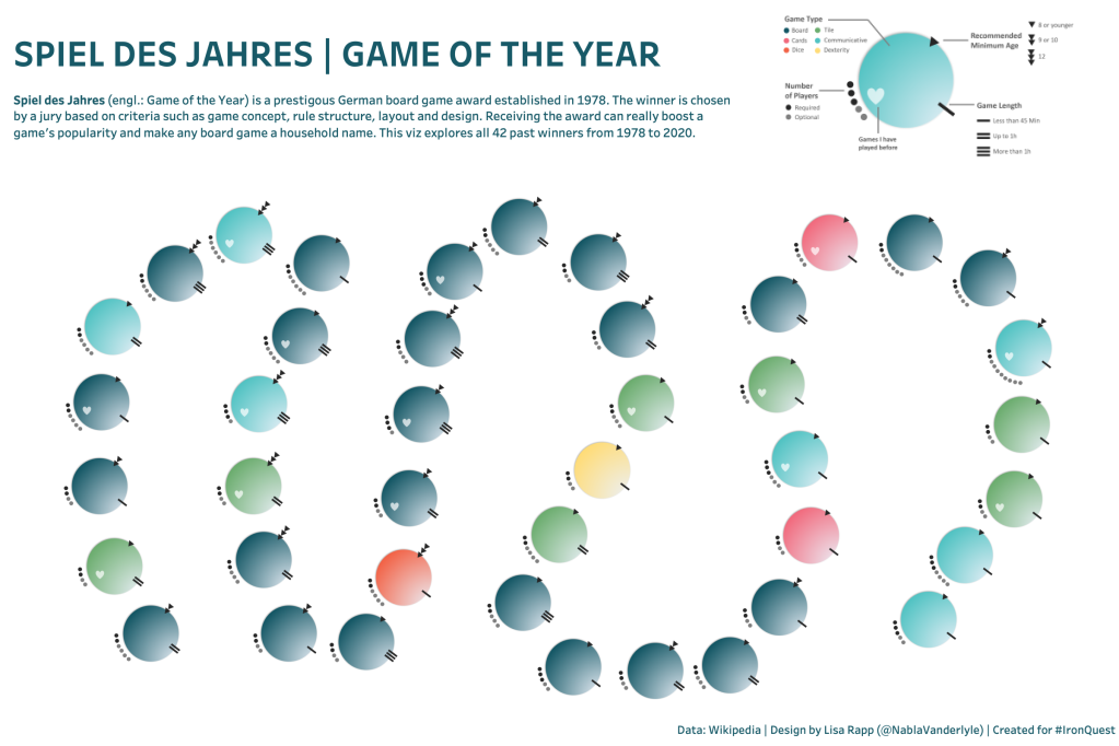
In Lisa’s visualisation she cleverly uses a layering technique of different shape files to create her desired effect. The best part is she overlays a circle shape over the top for a well designed tooltip.
Lisa hugely influenced my choice to create lines at the top of each circle for number of goals, as well as decide on using a shape within the centre. I really like how she offsets the heart in her visualisation to add a personal touch of the games she has played before.
In truth, Lisa’s is great. I have no reasoning as to not following the same build methodology other than I wanted to see if it could be done through no Tableau-only tools. Lisa’s dashboard hugely also benefits from not having to have copious amounts of data densification (Jump to methodology and charts to understand why!)
I’ve previously mentioned how impressed I was with Simons recent Lacrosse visualisation, but for those that missed it in previous blogs check it out, here.
Simon was kind enough to have a chat with me about column and row dividers. When making new visualisations I tend to mock-up some fake data first. I do this really just so I can get to experiment with the build quicker. I ended up making the chart for just one year (season) before applying it for the full dataset.
My main discussion with Simon surrounded how he used a row and column calculation to split them out. There were three options that sprung to mind. As a prerequisite, I was building everything around (0,0) so knew it was a matter of shifting further seasons either to the right or down.
Option 1: Simons method rightly splits out the grid using column and row calculations. He explains it in great detail in his own blog, here.
Option 2 (Chosen): I tend to find Ryan Sleeper’s blog is a great starting basis for creating small multiples in Tableau. I ended up creating my grid using these calculations. I then exported the X and Y co-ordinates to then fit into my original dataset. Check out the methodology to understand why.
Option 3: In a previous petal visualisation when making the MAKEPOINT() function I ended up just wrapping the movements in X and Y in a case statement. For example if it’s the next season, add 1 to the X to shift it across. (This would have been very time consuming for 60+ finals especially considering I would have to do it to the Y calculations too) These X & Y co-ordinates were used as a base.
I’ll let you form your own opinion on what the best method is. My data prep was nasty, so I’m in no place to comment.
James is well-renowned for making sports data look beautiful. I had a chat with him a month or so ago when he published some new Grand Slam visualisations in his Etsy shop. Check out Rafael Nadal’s dominance in the French Open, here.
I loved the idea of the tennis balls wrapping around the winner for total wins in the tournament! I think it is now fairly obvious why I added in the stars for number of wins by the year. This is where the concept came from.
With any external tools out the question I was left with some trusty sin and cosine functions and parameter actions to bunch the stars in a radial format.

Everyone knows Toan produces some of the most easy to use templates and tutorials in the community. I am forever grateful for his blogs as they are one of the main reasons I started.
This visualisation is no exception. So, which one inspired me?
It’s not easy to tell straight away without downloading the workbook. It is actually his Half-Circle Chart tutorial. Check it out, here. Should I wish to, my workbook is easily resizable on team.
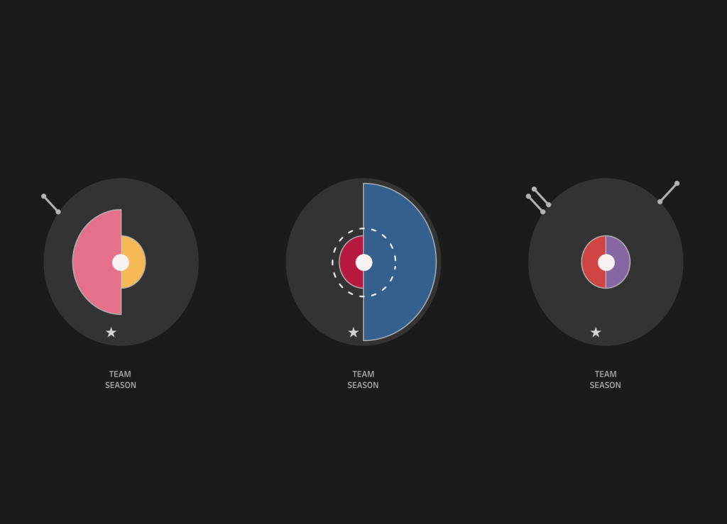
It saddens me slightly that anyone that didn’t download the workbook will think these are PI charts, they are in fact polygons. Little do they know they are 180 points each side joined up. Realistically as I don’t utilise them, maybe creating polygons wasn’t the right method to go down. Although, I am hoping maybe something in the future I can use this neat little trick.
I ended up steering away from this methodology.. mainly because Real Madrid winning so much meant the stars got in the way … shame.

Last, but not least. A massive thank you goes to Autumn. Above is her reaction to when I first explained what my next visualisation looked like. Turns out it comes with a great how to read section!
I want to mention I didn’t actually ask Autumn (to start with) to help me out, it really is just a true testimony to her loving character and nature to give genuine advice, tips. She has shown great pride in wanting to help others in the community out.
Autumn has a clear talent for design, if you’ve been following any of her recent posts, I’m sure you’d agree. I am so pleased she put the cherry on top for my visualisation. I think the key is so easily understandable thanks to her efforts.
If you’d like to see what she took from 0 to 100 check out the before and after pics.


Finally to round up this section.
I want to say a thank you to Anthony Pulley and Amar Singh who both offered words of advice early before posting my visualisation. I hugely respect their opinions and hearing their feedback is a great way to consolidate my own thoughts to a point where I am happy to share with the wider world. (#TeamLloyds – Woo)
CHART EXPLANATION
I will briefly give some ad lib as to how I created each section of my visualisation. I won’t go too in depth for the sake of this not being a novel. Attached are some print-screens of building each part of the visualisation separately.
The Axis

Teams
The above tutorial from Toan will get you most the way. I ended up building the entire visualisation using his tutorial. His co-ordinates fitted perfectly for what I needed so I didn’t even need to rescale the visualisation points hugely. I exported the path values and then joined them in separately to my dataset. It was then a case of just rebuilding within my visualisation but offsetting each team based on the season. The beauty of taking the exported points meant I could then rescale what the size looked like!

A couple individuals rightly mentioned the team semi circle colours don’t match the kit colours for the team. I ended up assigning a palette I liked to make the visualisation more aesthetically pleasing. Turns out most teams wear red, blue or white. I am more than happy if people want to download and re-colour the viz!
Stars
The stars have their own dataset. For each year, I joined in the equivalent number of rows. For example Real Madrid winning the title for the first year joins once. When they win the second year, I end up joining in two new rows to the main dataset.
Not to plug my own website… BUT sometimes I forget how I make my circles, like I don’t make enough of them? I revisited my tennis radial graph visualisation run through to copy out my rank, angle, sin and cos functions to making the stars go round in a circle. An added parameter is used to rotate them round the circle as well as squish them together into one half of the visual.

Goals
Again, a lot more data densification went on here. I ended up creating two points for each goal. Each goal has a point slightly more inwards point than another on the same X,Y trajectory from the centre point (0,0). It is then a case of joining them together with a line! I created the goals for the winner and runner up separately as to be able to move them to the top of the circle more easily using parameters. I reflected on my previous blog post of creating a radial comet graph. The only thing that is different between them is that I didn’t add a sizing to the line! Check it out, here.

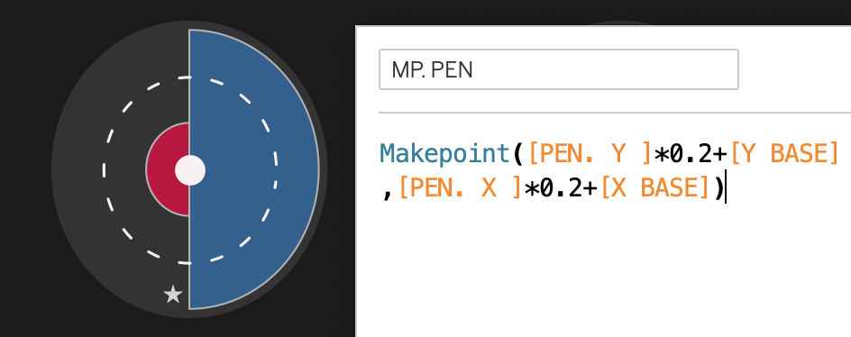
Penalties
I ended up creating a circle that was 100 points going round. The difference between the datasets is how I join the dots up. The following print screen of the data should help. Again, this will follow a similar pattern to previous for circles creating a rank, an angle, the spacing between them, and then co-ordinating which dots to join lines between!


Makepoint
Finally with everything made, it is a case of gluing the datasets together as well as creating A LOT of MAKEPOINT() functions based on our final X and Y calculations.
You can see that I actually build all my initial charts around (0,0) and then adjust the make points to add on my column and row amounts to space each final out! Typically each graph was made between -1 to 1 on both the x axis and y axis and then rescaled to the appropriate size.

For example: The above plots my X and Y co-ordinates for my penalty circles…. The *0.13 is simply a resizing factor for the circles. Check out the below example where I make the dashed circles larger. Finally I must adjust each of the locations of my penalties by the base. I.e Make sure the penalty circles are moved to the right column and row!
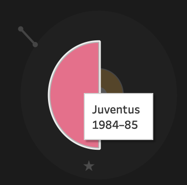
What I particularly do like about the visualisation is that I can create separate tooltips based on what you hover over, and the order of the layers.
Example below.


DATA AND METHODOLOGY
The very original dataset was taken from Wikipedia. I tend to use a Wikipedia table to CSV converter to quickly copy and paste my data before sense checking it and making a few tidy-up’s to any dodgy formatting. I find this far quicker than doing anything fancy with looking at source code, or trying to copy and paste straight off the site.

“Bet I could do it in 64”
One of the main downsides to my visualisation is undoubtedly the amount of data densification that sits within it. I’ve gone from a 64-row winners table to a table with millions of rows.
Each team is 180 points for the half circle, each star is an extra row per star for that season row, each Goal is two rows, and the penalties are 100 dots, as are the extra-time markers…. This really adds up.

Above is the 7 dataset tabs i stitched together.
I could have made a lot of the elements using custom shapes but I enjoyed the challenge behind creating this. Tableau Public aren’t quite the fan given it fails to render a few times and the thumbnail on my profile doesn’t always show. I may go revisit this at some time simply because it is ruining my colour theme (or lack of).
As to not finish on a sour note, I am actually super pleased with the reception this visualisation got. I personally believe it’s one of my best visualisations yet! It was definitely one of the most fun to build. Thank you so much to everyone who reached out in admiration – it means the world to me the support and feedback.
I am so grateful to be surrounded by such talent in the community.
If anyone has any questions, give me a shout. You can reach out to me on Twitter, or Linkedin.
Logging OFF.
CJ