
Hi All,
Welcome to the March episode of “What’s Good?”
For this month, It’s a true delight to have Sam Parsons join, to discuss building a versatile skill set through your portfolio. We cover themes of observing, doing and learning. I’m eager to explore the different milestones in some of Sams development.
If you’re anything like me, you’re in awe of, not only the calibre of Sam’s vizzes, but the impressive depth of different technical skill sets on show. Design, difficult calculations, storytelling, best practice, abstract art, business dashboards… literally, you name it, Sam probably has it on his profile.
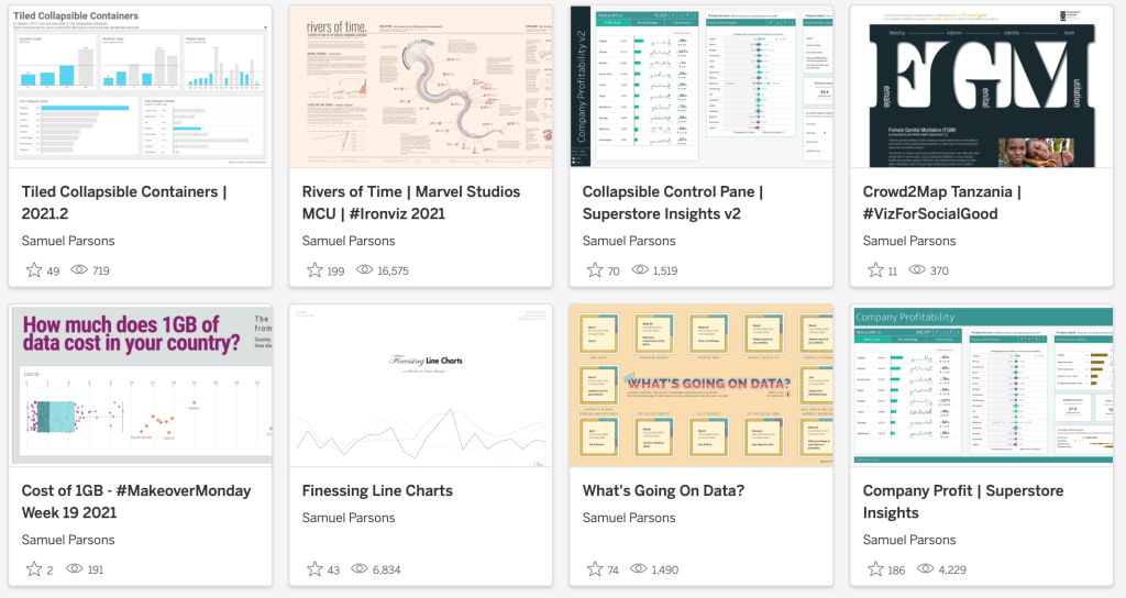
To reinforce the breadth of style on show, take a look at some of my favourite of Sam’s vizzes below.


CJ: Sam! Thanks for joining. Let’s roll back the Linkedin – you’ve had with a range of product design at university, Business analytics roles and then into data visualisation. Tell us a little more about these experiences. It seems to be a unique mixture in skills – would you say you’re a left brain thinker or right brain?
Sam: Hey CJ! Thanks for inviting me to talk with you. So we are starting with a trip down memory lane then, ha. OK, I’m game! Growing up I spent most of my time drawing, painting and model-making – I loved creating things. Naturally this was the way I was wired. This was reflected in the school subjects I enjoyed and I decided that I wanted to study Product Design at university. I love solving problems and I thought a career in Product Design would be a perfect marriage of problem solving and being creative. As it transpired, the course I enrolled on was actually run by the engineering faculty and so there were far more engineering based modules than I first realised. A lot of the students dropped out in the first year and switched to a more design based Industrial Design course. I decided to stick at it and actually this has proven to have been beneficial now I’m working in Tableau. Why? Well, I was forced to work in very mathematical areas, such as Thermodynamics, Material Stresses & Strains, Robotics, all sorts of areas that you need to understand when designing a product solution. These subjects really made me approach problems with a logical mindset.
When I left University, I became a little disillusioned at my own ability as a Product Designer and I needed to get some money in quickly. So I joined the National Trust in their Finance team. I started as a temp worker and slowly I worked my way up. I enjoyed working with the people there and before I knew it I had stayed 5 years and I suddenly realised that this was the career I needed to make something out of. So I started studying accountancy qualifications and I was showing a real flair for using Microsoft Excel. This enabled me to continue moving up and into the Business Analyst role. I became ‘the Excel guy’ within Finance in the company and was entrusted with building complicated Excel models that supported and filled in the gaps within the company’s Finance System. I honestly thought that was my career. I was going to stay there till retirement.
Then Tableau came into my world. I immediately saw that Tableau allowed me to reconnect with my creative side of myself and I had an awful lot of fun playing with it in my spare time. Within 3 months of picking it up for the first time I had applied to Dyson as their Senior Data Visualisation Developer. I somehow had convinced them that I knew enough about Tableau and design that I could take the team forward with their own suite of reports. From there I stayed 3 years and moved on to Biztory as a Senior Analytics Consultant.
My career path has definitely been mixed one, Early on my career path was more by accident than design. Since Tableau though I have been very focused on what I want from my career – something I have not had in the 15 years previous. I am naturally creative and I love problem solving and looking for solutions, Yet my engineering and analysis roles have built into me that logical and analytical mindset. I have been burned a few times along the way, but all those experiences I believe have really helped temper me into the character I am today.
CJ: You’ve been at Biztory just shy of a year. How are you finding the transition from an in-house build to a consultancy type role? Has there been any strong learning opportunities you’ve experienced either in technical or soft skills with the change in role type?
Sam: That’s an interesting question and one I was asked by a candidate I was interviewing recently. The transition has not been a difficult one in my opinion. I have been exposed to stakeholder management in my career before and so being put on to client work early on didn’t faze me at all. The team at Biztory have been fantastic in their support to new employees, it’s very much an ‘arm round the shoulder’ type company and the skills within the company are like nothing I’ve seen before. So that filled me with great confidence that if I was asked anything from my new client that I didn’t know the answer to, I knew I could ask internally and I’d probably get the answer from the team within the next 20 minutes. Biztory put great emphasis in learning and developing their people and as such I have been afforded a lot of time to work on my own skills since joining.
Consultancy was a new thing for me and so I was acutely aware that building working relationships with the client quickly was key. Those soft skills as a consultant are near as important as your own technical skills. I’m lucky that Biztory aim to line up the right engagement with the consultant with the skills to match. So the whole thing has been rather painless so far – touch wood!
CJ: We’ve just had this year’s Iron Viz feeder. One which you probably know well about given last year’s performance! Was there anything that particularly stood out this year? Were there any personal takeaways you had from hosting some of the review sessions that Sarah set up? (link)
Check out the IV Gallery here.

Sam: Firstly the level of quality of this year’s entries were so very good (yours included!) I particularly liked that this year from a design perspective there seemed a lot of variety with the choice of viz set up. By that I mean, in previous years we saw Iron Viz was mostly long-form vertical entries, but this year I got a real sense of variety – some long-form, some wide-scape, some using story points and others customs navigation buttons. I like that it was a little more mixed up this year, it made it visually more interesting. Your own entry was one of the few that saw to keep to a single screen space with no scrolling or button navigation required.
I also felt like I saw a few more Glyph Charts (using map-layers and icons / shapes) than previously seen – this I am a little mixed on, because normally I dislike those types of charts. This is because when size is being used on the different elements they are so hard to make comparisons – it doesn’t feel like best practice and from a Iron Viz perspective they would struggle to score Analysis points (in my opinion). However, when these charts are operating in a more Boolean way (the shape is shown or not shown, it is coloured red or coloured black), then I think they are much more accessible and easier to understand – for example, Kimly Scott’s entry this year (#IronViz 2022 | Winning the Archibald Prize | Tableau Public). It does this Boolean approach very well.
My main personal takeaways (having sat in 13+ sessions giving feedback) were probably these three things:
1. Design – This appeared to be the main focus of a lot of entries (colours, fonts, stylings etc). I would say this appeared to be overly focussed on, especially considering my next two points.
2. Context – So many charts were placed without introductory text or with supplementary annotations that help the reader understand what they should be focusing on. Giving that context to the analysis will really help those analysis scores.
3. Storytelling – This was by far the scoring criteria that was not focused on enough – I actually found it frustratingly so. Maybe it’s because I have a different viewpoint on storytelling than other people, but for me, presenting an overview of a dataset is not Storytelling.
The process I would love to see is, something like this:
-
Analyse your data, using Tableau
-
Research to find how your data could lead into a bigger story or another dataset (i.e. what’s your story angle?)
-
Then plan how you would like to take the reader though the data to that storyline conclusion.
-
Use your design to make it easy to follow through the viz and draw emphasis to the key areas.
-
Pick your charts to support the analysis
-
Order your analysis to bring the reader through your storyline.
Being able to present a cohesive story line using your data is the Holy Grail of Iron Viz. It’s not easy and I don’t always achieve it myself.
Lastly I was sad not to see more people use, and also creative use, Show & Hide containers. If used correctly they can really set up the flow of the story line. I was hoping my Iron Viz final entry might have inspired a few to try it.
CJ: You will forever have had a long lasting influence through your Iron Viz submissions and the knock on effect of helping others through your strengths of analytical mindset, design talent and storytelling abilities. Is IronViz where you would like to make the most impact in the community?
Sam: Honestly, no.
I think as we move through this interview, you’ll see I don’t like to be pigeon-holed as a single thing. I LOVE IronViz as a competition – I have my personal views on the format and other things like feedback, but overall I love what it gives our community and how it pushes people to move out of their comfort zone and test their skill sets. It’s fabulous. I am also proud of the vizzes I have created for IronViz, each one I learned something new and the same could be said for those entries I failed to submit (like this year). IronViz is great.
Would I want to be known for making my biggest impact in the community with Iron Viz? No.
I love doing me. I like mixing up my styles with the vizzes I make, how I move in and out of writing blog posts on topics that interest me and I love providing feedback for others.
Personally, I have no ambitions on how I want to be known to have made an impact, other than my input into the community has been a positive and inspiring (if possible) one.
CJ: One thing I think is important is building your personal brand. A lot of that is evident through the portfolio of vizzes on your profile. They are all different in style but all easily associated with you. What advice would you give to others in terms of building a personal brand, without falling into the catchment of making them look visually similar?

Sam: This is difficult because I have never intentionally set out to create my own ‘Brand’ or ‘Style’, yet I’ve had others say similar things like ‘You can always tell when it is a Sam Parsons viz’. That for me is strange, because I don’t see my work in that way. I’ve guessed before as to what made my work attributable to me, and I’ve come up with questionable tags such as ‘adding lots of little details / flourishes to vizzes’, ‘technically stretching chart techniques’, but I really struggle to put a finger on it as a Brand.
What I do know, is in building my own profile or Brand, if you want to call it that, I concentrate on these two things: Experimentation & Internal Focus.
Experimentation
I have always, in every viz I create, tried to look to do something new for me. That could be a chart type, a design layout, use a new feature, or a different colour palette. I like to test what works and what doesn’t for myself. I can see how others in the community might do some of these things, but for me to truly understand them, I need to test it for myself.
A good example is looking back to Makeover Monday from 2020, week 21 – that week was a very popular week looking at the technology changes within the music industry. There were so many fantastic area charts created that week (e.g. Alexander Vassilev’s – How Music Entered the Digital Era | Tableau Public) , but I wanted to try out a different style, I wanted to try creating a boldly coloured visual and see if I could make them work together well. We are taught that the less colours used the better and to supplement your main colours with shades of grade – this is visual best practice. I wanted to experiment with making something that visually worked but doesn’t stick to the rules (My viz: Tech & Music – #makeovermonday Wk 21 2020 | Tableau Public) , and this leads me nicely into my 2nd point.

Internally Focused
The nature of our supportive community is that we are actively encouraged to share our work on social media, seek feedback and support others with their work. This means inevitably that our work is tagged with ‘likes’, ‘favourites’, ‘retweets’ and comments. It can be highly addictive with the social media gains to be had from positive responses and new followers after a release of a viz. I’ve had many a high when my Twitter explodes after a piece of work is well received. The key point is not to go searching for it. You may create a long-form viz in a minimalist black & grey style, using certain fonts and lots of white space and get a great reception of the viz. Naturally you would be tempted to repeat those different elements in your next viz and gain a similar response. Then you do it again, before you know it you are known for a particular style. I try to avoid that temptation, because for me, what do you learn from this? Very little. I’d much rather focus on mixing it up for my own learning than look to try and get a similar response from everything I do. For me, this has provided so much more learning and it broadens your skill set and as a visualisation designer I feel I’ll be in a much better position to transition from one client to another taking and applying different branding styles. It just happens that this also lends itself to the Iron Viz competition very nicely. This avoidance of keeping to a design formula that works is probably a factor in why I don’t have a high output on Tableau Public, because each viz I’m spending more time thinking about a new style or format, rather than the quick win of replicating a style that works.
CJ: I would say up until early 2021, your profile shared a lot of visualisations focused on more unique, abstract or radial style of visualisations. What was the thought behind making content like this?

Sam: Very similar to my last point about experimentation and doing it for yourself. Early on I used my Tableau Public to accelerate my own knowledge of the tool. I did this by trying new chart types (Jump Plots, Radial Charts, Stream Graphs), but I would achieve this by following a blog post rather than connecting to a ready made template & workbook. I would force myself to try to understand what was happening in the chart build and then I would just have fun with it. In some ways I used the Makeover Monday project for my own goals and I’d also experiment with the designs and formatting etc. From there I decided that I wanted to try out other things. I played with Mapbox an awful lot (although not many vizzes made it to my profile). I then tried to simplify designs but layer on little details – example: Remote Working | Tableau Public where I used a waffle chart as the only chart, but then added in a connecting line for each dimension. It’s a simple design, but one I customised and learnt something from. From each of these experiments, I was understanding how to present data, what little elements help and what hinder the reading of the data. I have also since done a few makeovers of my own vizzes, because I know now I could make a better attempt at showing that data.
CJ: Something that I think you’ve briefly alluded to in your episode on Data plus Love was the notion of having a sort of ‘show stopper’ visual with smaller if any other supplementary charts round the side. Is this something that’s happened out of coincidence or do you think it plays a larger part within the context of story telling? (link)

Sam: I loved speaking with Zach Bowders on his podcast and yes we spoke about ‘Show Stoppers’. It is something I feel in the Tableau Public space is really useful to have to draw people into looking at your work. In a competition viz it creates a wonderful focal point to the viz. When you spend 60+ hours on a viz, the last thing you want is no one to look at it and comment on it. It’s good to receive feedback, good or bad, but to receive silence can be annoying – this is slightly different than my previous point about not chasing the social media wins. When you spend a long time on something you want feedback. Competition vizzes are less about experimentation and more about putting your knowledge into action – that’s why feedback is key and welcomed. I know from my own experience that if I’m looking through vizzes on Tableau Public Discover page, I’ll stop and open the vizzes with the interesting visuals, chart types and eye-catching elements. Equally I’ll probably not open those that look ‘standard’. Not every viz can have a ‘show stopper’, but sometimes if you can create something that shows off the data and people haven’t come across its type many times before, it will really draw them in to spend time on your viz.
CJ: You slowly transitioned to building dashboards of different lengths, layouts, colours and use of fonts in early 2020, alongside gaining qualifications in Adobe products. How did completing certifications like these help you gain a better understanding of styles, framing, colour and layout? Did it play a part in a more design focussed phase?

Sam: 100% yes they did help in that aspect. Back in early 2020 saw an influx of new talent in the community that were supplementing their visualisation with the use of Adobe Illustrator and Figma (people such as Judit Bekker, JR Copreros, Ghafar Shah and David Borczuk and others). They brought a rich new feel to Tableau visualisations and in March 2020 I booked myself on a week-long course to learn Adobe Illustrator properly and become certified. The reason for that course was at the time in my visualisation role in Dyson we were creating Data Posters to put up internally and use at our Analytics Conference. I was stuck using PowerPoint for my design tool and quickly recognised the need to use something more attuned to the task. It was without a doubt one of the best things I have done. Taking inspiration from Judit and the others I was quickly able to use those new technical skills to wireframe my visualisation work outside of Tableau. I now had access to a package that I could alter the layout, dashboard styles quicker than I ever had before. This then led me to easily try different styles of data viz and make a more polished effort at them. Like anything though, I still like to mix it up. Some vizzes will have a large Illustrator base and others none at all and will be 100% Tableau. Switching it around keeps it interesting for me and allows me to understand what is possible in both scenarios. For example, you wont really see me using Illustrator to create business dashboard backgrounds – because they are not scalable in a real business use case. They look great and give a nod to what should be possible within Tableau, but right now, Tableau isn’t there yet with dealing with that level of design inside the tool.
The other element that Adobe Illustrator and After Effects (which I’m also certified in) provides from a learning perspective is the encouragement to think around a design issue with a ‘designers mindset’. The Adobe Creative Cloud suite of apps are big on using Layers and there is a process you go through to understand how to properly use Layers to create the effects you are after. Transferring that into Tableau, you can create some fantastic visualisations by layer marks using Map Layers, or layering worksheets if you have a like for Floating objects. It is that mindset that allows you to think around a problem. For example, I recently published a Business Dashboard that I wanted to use gradient area charts (European Superstore Sale Performance | Tableau Public). I didn’t want to densify my data (by adding rows to the data source) and potentially slow the workbook down. So I had to think about the issue. So I used a Background Image on the worksheet which made the gradient. Then I inverted an area chart to colour the area above the line white (to mask the gradient above the line). This worked, but then I found with filtering the data became sparse and I was left with the full gradient showing at either end of the area chart. So again I layered in some reference bands to cover those areas up in white – but only when certain criteria was met.

Branching out and broadening your skillset away from pure Tableau is something I highly encourage. Through my Illustrator training I became more aware of Typography and its component parts. I actively sought out LinkedIn Learning videos on the subject to learn even more about it. Typography is an art form in itself and choosing the write typeface can really help make or break a visualisation.
CJ: Besides perhaps certifications both Tableau, Adobe etc, what tips and tools helped you build out your current skill set? Is segmented attention and focus on specific types of learning, easier? Is limiting the number of learning sources (i.e tableau public / blogs / external sites / books) beneficial or constrictive?
Sam: I’ve always found stressing yourself a good way to build out your skill set. Taking yourself out of your comfort zone and experimenting.
For example, when trying a new chart type, lets say for example – a Sunburst chart. You build the chart by following a blog post (don’t connect to a Template). Then force yourself to understand the steps that were required to build the Sunburst. You’ll more than likely find it fails the first time and that the author of the blog has left out the instructions on what to do with the Table Calculations – you then have to find and work those out to build the final chart. When you do that, don’t necessarily stop there though! Give yourself a task, like “Turn the sunburst chart into a half circle” – that will mean you then need to find that part of the calculations to instead wrap the chart round 360 degrees, but only 180 degrees. If you do that, you’ll have made a bespoke visualisation. You could go further, maybe your half-circle sunburst is running from 12 o’clock to 6 o’clock, try rotating it by changing the maths, so it goes from 9 o’clock to 3 o’clock.
All of this is forcing yourself to understand more of the workings of Tableau and calculations and it’s taking yourself out of your comfort zone from just following a blog post that has it all laid out for you. The more you do it, the more you gain and learn.
In terms of learning resources I have to confess I read very little. I don’t have the attention span to read many visualisation books or read all the blog posts written by people I respect. I’m very much someone that will pick and choose, as if I was at a buffet! I’ll search for a blog on a subject I am particularly interested in at that time. Or I’ll find the page of the visualisation book that I think will be helpful. I particularly learn from doing it myself being hands on – hence why I probably experiment so much on my profile. I do those experiments in buckets, one month I’ll focus on business dashboards, another month on a new feature of Tableau. I do find for my own style of learning that helps. None of it is really planned though. I focus on whatever I feel inspired by at the time!
CJ: We then pivot again, with your work focussing a lot more on business dashboards. How did your collapsible container vizzes and multiple sales store vizzes help in your personal development technically? Did it change your thought process on how you approach analysis for work?
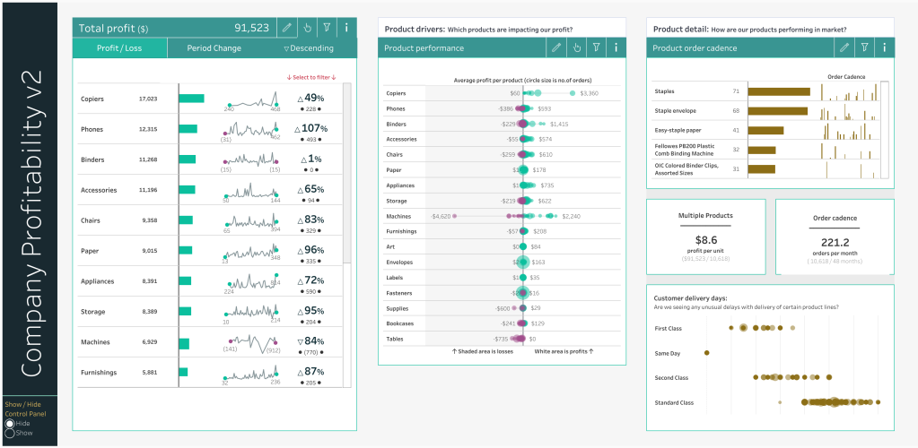
Sam: The focus on Business Dashboards was a conscious choice. I had previously put some thoughts down on chart design (Finessing Bar Charts | Tableau Public and 2020.4 Beautiful Business – Pies & Doughnuts Edition | Tableau Public) but I hadn’t tackled any business dashboards outside of my working life. So I set myself a task one day to create one that would include a fully collapsible filter panel (this was before tiled ‘show and hide’ came into the product), I solved that problem in this viz: Collapsible Control Pane | Superstore Insights v2 | Tableau Public – but also in that viz there was something new, that only a select few people noticed! I also ended up creating a single sheet that included a horizontal bar chart, a sparkline chart and a KPI value for each data dimension and was scrollable (vertically) – technically if you think about it, that should not be possible. It’s these problem solving challenges that I love with Business Dashboards – it’s being creative, but in a different way to the obvious. Technically business dashboards are a great way to help your personal skill set development. These sorts of challenges force you to think around the problem technically. If you are then able to bring those solutions back into your everyday work easily then great, but even if the solutions are too complicated to deploy, you have still learnt something from the process.
Talking of collapsible containers (Show & Hide objects feature), we will really see these take off from a business perspective when they become dynamic and controllable via parameters / parameter actions. I honestly cannot wait for that feature to land. We will see some really cool stuff from the Tableau community when it goes live.
CJ: More recently the past year or so I often sit and think… “Wow I couldn’t make that!” I’m not saying this is the new phase…. But would you say a lot more of your content now explores ideas and concepts that are new, a stretch of the tools imagination, and things that haven’t been done before?
Sam: Thanks CJ – that’s very kind of you to say! As you have gathered I enjoy pushing myself and playing with Tableau. I think as my technical skill set has increased both in Tableau and in other tools I have been keen to keep pushing myself to see what I can achieve. I am very much not a Maths person, I was never great at it, it really through my career has become a necessity to work with – Engineering, Finance, Business Analysis and now Tableau. What I have found is that I am quite brash with my approach, I look at other people’s work and think, “if they can do it surely I can do it too?!” So, I try very hard and don’t let myself be defeated before I start – not to be overawed at the task. The River of Time viz (Rivers of Time | Marvel Studios MCU | #Ironviz 2021 | Tableau Public or the Viz for Social Good viz (#VizForSocialGood- Self Reflection 2017 to 2020 | Tableau Public) are both good examples of this. Technically, I had no idea how to do this when I started, but I forced myself to think around the problem logically. I took the lead from others such as Ludovic Tavernier (Weather Memories) and Luke Stanke (Circular Sankey) and tried to understand their approach and then adapt it to work for me. Logically I knew I could build the maths out a step at a time and that’s what I did. Both of these vizzes were built in stages, when one stage was complete I looked to build on the next level of complexity. For the Rivers of Time it was altering a radial into a double length wave form, into a tilted wave that tapered at one end. For the VFSG, it was building a circular Sankey, then a radial bar at the next level, then the next level Sankey, then another bar, then dots and horizontal lines.
I really enjoy exploring where I can take my own skills and where I can take Tableau visualisations. I get a lot of pleasure from that. That said, I still enjoy making my business dashboards or working on a new feature or trying a different design choice!
CJ: A lot of individuals enjoy following tutorials of recreating charts. But, often this can be tough to do from scratch. Vizzes such as your Rivers of Time & Viz for social good will have required a lot of new learnings, alongside reverse engineering mathematical components from other vizzes. Do you have any tips for testing how curves work through data densification / bins? How about tips in general for reverse-engineering calculations?

Sam: I do tend to reverse engineer other peoples workbooks quite a lot and if I’m looking at a custom chart, I tend to track back from the fields placed on Rows and Columns first. Those tend to be the coordinate locations for the plot and so if the visual includes a radial element, then you can be sure it will end up in a trigonometry calculation at some point. What I like to do is intentionally break the calculations. By that I mean remove one part of the calculation and see how that impacts the visual. Sometimes I’ll add a value to another part of the calculation and see what changes. Through experience I have noticed a lot of reverse engineering can end up with finding a calculation with a number of fields and then a random number included somewhere. Those random numbers are the most annoying parts, because they could legitimately be a good reason for being the value it is. Other times those random values that appear in the middle of a calculation can just be there because the creator wanted to adjust the final view to fit what they wanted. Trying to work out which one of the two they are is very annoying and sometimes like finding a needle in a haystack. Quite often I don’t always fully understand the reverse engineering part, but I understand enough as to how the creator was intending it to work. From there, if I wanted to do a similar view, I have a good basis to maybe approach my own work.
CJ: When would you say the biggest stretching phase, in terms of learning, has been within your Tableau Public work to date?
Sam: That’s a really hard question to answer! My first year I was really exposing myself to a whole new world of visual analytics and trying to build and create content I was happy with. Learning concepts of LODs and Table Calculations was a stretch. I have never gone through the Desktop I, II and III official training. So initially I found it a stretch. In year two, I was finding my feet a little more and gaining real confidence over what I could create. But in the last year and a half I have really stretched myself technically. I have been pushing my technical side with some of my well known visualisations, but also behind the scenes I have been moving on my design understanding. I have also internally at work been working through a whole host of Workout Wednesday technical challenges. Those have really helped me understand Table Calculations even more than before. So, I’d say my most recent year has been the biggest stretch in my learning – but that’s because I have pushed myself to try more difficult things.
CJ: Is there anything you’d like to share from a personal standpoint as we look to the future of 2022?
Sam: I have no grand plans for 2022 or any big announcements to tell. I’m just going to continue doing what I do and fit it around the family and daily life as best as I can. One area that I will be looking to improve is my coding ability. Currently I don’t do any SQL, Python or else, and now I feel the time is right to start up-skilling in that area. I hope though that it will impact my ability to output more Tableau Public work.
Lastly, I really cannot wait for TC22. I am hoping to be there, my first US Conference and if anyone sees me, please stop and say hello! I would love to meet everyone!
CJ Round-up:
This blog is action packed with tips, thoughts and reflections that are so useful for development! The reason I don’t put “TLDR’s” on my blogs is because, well, blogs like these are art in themselves and deserve the time to read. I want to thank Sam for his authentic words, helpful advice and creative journey he took us on.
A few highlights for me included the personal branding element around experimentation and internal focus. This really resonated with me. I think it is such an admirable thing when someone wants to improve at something, every day becoming a better version of themselves – be it in technical grounding or other avenues of life. Sam rightly mentions not getting caught up in the social media echo chamber, which has paid dividend in some of the beautiful range of work he’s produced.
The second highlight for me was watching the different ways of approaching a problem or creating an effect with different methods. I recommend anyone to go back and download the gradient line chart in his business dashboard. There are some treasures within it.
The final thing that sprang to mind was our similar pattern in reverse engineering workbooks and the pesky random numbers!
Looking forward to meeting Sam at the Tableau Conference in a few months. In the mean time, do connect with Sam on Twitter and Tableau Public.
LOGGING OFF,
CJ